How we turned deadly heatwaves into vacation brochures
Extreme heat kills hundreds of thousands yearly, yet media often illustrate it with ice cream and fountains. This article explores how misleading images distort climate reporting—and why better visual choices are crucial for telling the real story
Look, here's a thought experiment for you.
Imagine if we covered earthquakes exclusively with photos of families having picnics in the park. Or if every story about devastating floods featured kids splashing in puddles. During COVID, we all remember those haunting images – empty Times Square, mass graves in Brazil, refrigerated trucks outside hospitals. What if instead we'd only shown families baking sourdough?
Sounds insane, right? Yet that's exactly what we're doing with extreme heat.
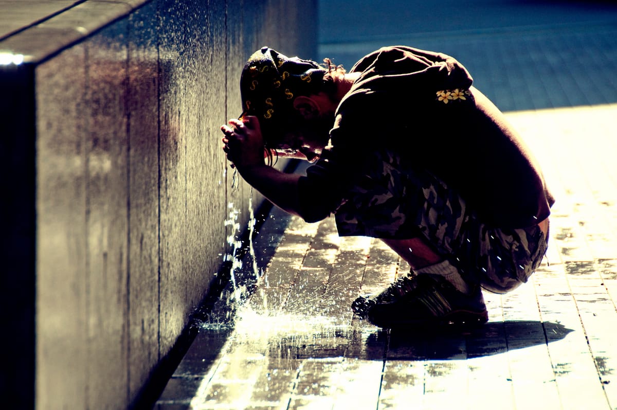
We're talking about half a million deaths annually from heat – 178,000 in Europe alone, according to Lancet Planetary Health. Stress on livestock and wildlife, plants that can't just migrate to cooler spots like animals can. Major crops like wheat, corn, and rice producing less. And what do we show? Tourists dipping their toes in fountains. Kids eating ice cream. Young women in bikinis, shot from behind (definitely not for privacy reasons).
The story we're not telling
I covered last summer's European heatwave like many other journalists. I followed all the best practices: avoided apocalyptic tones that make people give up, steered clear of the "everything's fine" narrative that normalizes disaster. Found experts, wrote the piece, calibrated the message. Nothing heroic, just responsible reporting of an important and delicate topic – but not so common, at least in Italy, judging by this report from Greenpeace and the Osservatorio di Pavia.
Then came time to pick the images. Usually it's simple: type in keywords, browse the photo libraries, pick something that works. Not this time.
Search "heatwave" or "extreme heat" on any stock photo site. You'll find: gelato lines, fountain fun, river jumps, and those spray fountains that shoot up from the pavement – perfect for kids and, apparently, photographers. The images could double as tourism ads or the world's worst postcard collection. They tell a completely different story than the one I'd just spent hours writing.
Here's the thing: most climate journalism guidelines say nothing about images. The ones that do – like Covering Climate Now – mention it as an afterthought. Only the European Broadcasting Union's report actually dedicates real space to visual choices. Perhaps they assume someone else will handle it – a picture editor, maybe. But most newsrooms don't have those anymore. It's usually the writer, exhausted and ready to publish, or someone else without training who picks the image. Even dedicated picture editors follow newsroom culture, which often means: make it eye-catching.
For every Guardian article (they revised their image guidelines in 2019), we get thousands of ice creams and pool parties.
Why we can't see heat
Part of this is biological: humans literally can't see temperature. Flames and glowing metal aside, our eyes don't register heat. A parking lot looks identical at 40°F or 120°F. The construction worker paving it can't exactly work in flip-flops and swim trunks for safety reasons – so their appearance gives no visual clue about the temperature, either. We see temperature through thermometers – basically the visual equivalent of a cliché.
But there's more to it. Saffron O'Neill at the University of Exeter studied this disconnect. Her team analyzed 250 heatwave articles from Germany, France, the UK, and the Netherlands. Less than 1% of articles described heatwaves positively – but a third of the images showed happy scenes. Articles detailing health risks, emergency plans, and official warnings came with photos of water parks and women in tight "hotter than wasabi" t-shirts.
The dissonance isn't necessarly malicious. We can apply Hanlon's Razor: never attribute to malice what stupidity explains – or better yet, what systemic factors explain. Heat has been humanity's friend for most of history and cold still kills more people than heat – though that gap's closing fast. We associate warmth with good things: "affection is warmth" is one of the conceptual metaphors analyzed by linguist George Lakoff. Our first instinct links heat with pleasure.
The damage we're doing
Images aren't decoration. They shape understanding. We instinctively create connections between text and images. When those clash, the happy photo wins: it says heat means relaxation, even if you're a delivery driver working through noon in July. O'Neill's research shows another problem: the missing people. We have young folks with ice cream and portable fans, not the elderly, outdoor workers, or anyone without AC.
Images can lie without being fake or AI-generated. They lie through framing, lighting, selection. They build authority, masculinity, or innocence through codes we recognize but don't consciously process.
Ernst Gombrich, the art historian, wrote something that stuck with me: an image "can no more be true or false than a statement be blue or green". He's right – or at least I don't have the gut to contradict Gombrich. Technically, images don't make claims so they can't lie because they don't actually say anything. The captions and headlines do the talking.
But here's where it gets tricky: images interact with those words. They shape the story even without speaking. A portrait can construct authority through the angle, the lighting, the crop. It can make someone look powerful or vulnerable using visual codes we've absorbed but rarely think about. That beach photo next to your climate article? It's not lying, exactly. But it's telling a different story than your text.
What actual solutions look like
I want to conclude this article with a positive note.
The photo archives are the bottleneck. Even with good intentions, scrolling through hundreds of beach shots to find one construction worker is exhausting. Climate Visuals, run by UK nonprofit Climate Outreach, tackles this directly. Search "heatwave" there and you get: traffic jams in summer heat, workers in extreme conditions, elderly people in public cooling centers, urban greening projects that actually reduce heat islands. Not water parks.
They've developed seven principles based on research about how people actually respond to climate images:
Real people, not stock photos. Staged shots feel fake, even manipulative.
New stories. Skip the polar bears and smokestacks – they're wallpaper to anyone paying attention.
Show scale, not shame. One burger or car trip triggers defensiveness. Show the feedlot or the traffic jam instead.
Balance emotion with action. Flood damage can motivate or paralyze – pair it with solutions.
Know your audience. Climate-aware folks respond differently than skeptics.
Make it local (when it matters). Proximity grabs attention, but connect local to global.
Use protests carefully. Most people don't identify with protesters, except when they're directly affected communities.
Bottom line
Climate change is one of the most urgent challenges we face – no question. But we can't underestimate the power of images either. The wrong picture can completely sabotage even the most powerful, well-researched article.
We've got the tools – Climate Visuals proved that. We know what works. The question is whether newsrooms care enough to use them.
Next heatwave, pay attention to the images in your feed.